About
Hollie Stephenson is a brilliant 16 years old singer and songwriter from London who was discovered by the grammy musician and legend Dave Stewart from Eurythmics / Dave Stewart Entertainment. When I was in Los Angeles at Dave Stewart Entertainment, Dave asked me if I could look on a drawing made by Hollie and use it somehow for creating her own brand. Credits/ Photography Dave Stewart Entertainment and Michelle Shiers.
Industry
Music
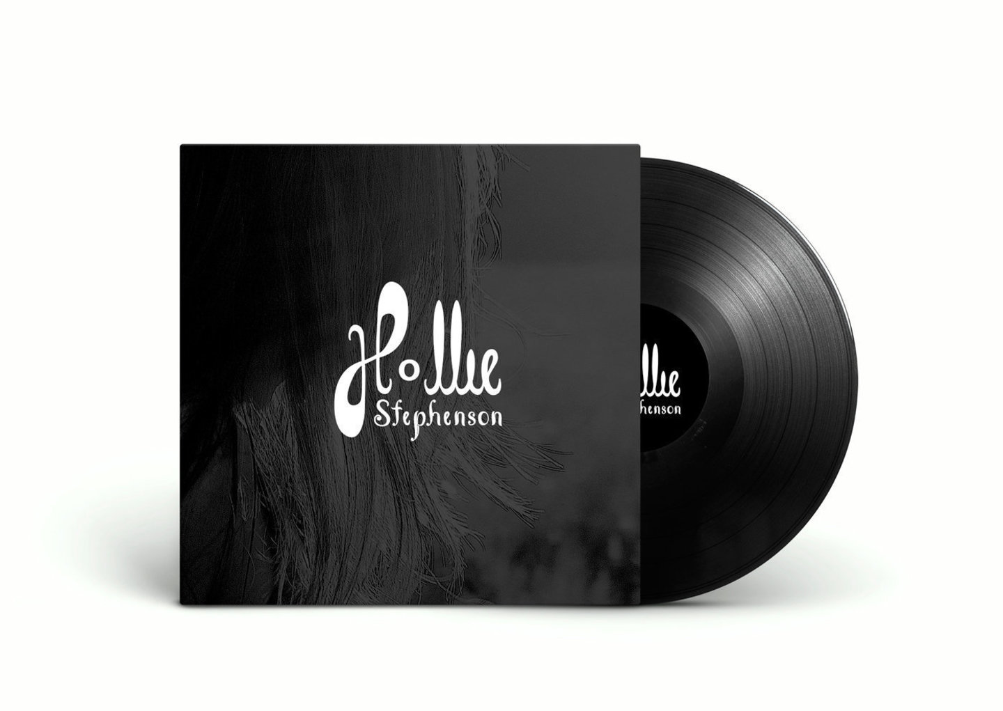
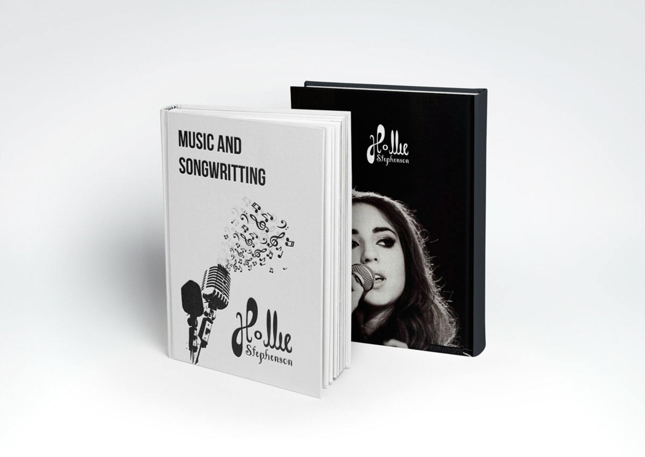
The brand needed to integrate the personality of Hollie and the type of music she is writing and singing. Practically the brand needed to have a jazzy feeling, inspire music and good feelings.

When I first saw the drawing, I found the potential in keeping the good parts and use it for shaping Hollie’s personality brand, but after vectorizing the draw, the letters were still giving a childish look and the jazzy feeling was still missing.

As a solution, I decided to create a more vertical look, by aligning the letters and keeping the usage of the “o” as a surprising element that can be translated in a musical note. This gave me the idea to create a font especially for “Stephenson”, a font that is complimenting the overall look and gives the needed jazzy feeling and touch.
A logo doesn’t have to represent what a company does, but using details in order to create the desired feeling and touch is a great solution. The “H” was a great start to make me think of musical notes, as well of treble clef and the “o” as a whole musical note. When I had all this elements in mind, I used the “forte” element we often see on instruments.

Role
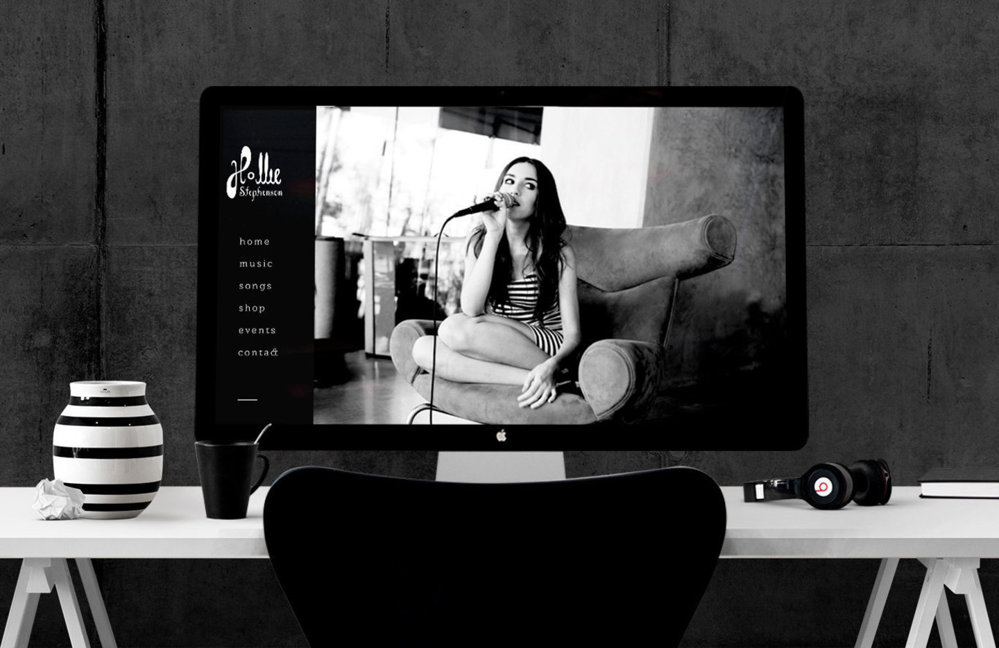
Project services / Branding Design, Branding Identity, Design Strategy, Design Consulting including creation of Logo, Color Palette, Font, Typography, Illustration, Mock-ups.
Skills
- Brand Identity
- Graphic
- Illustration
- Logo Design
Turnaround
Within 3 days