
About
As an alternative news/media organization, my client relies on new, dynamic homepage content to secure constant, repeat visitors. The client knew the homepage needed a fresh look and a dynamic interface but just wasn't sure what or how. With many years of design and marketing study, I knew just what the website needed: a bold, eye-catching initial impression that continued to engage the visitor as they scrolled. As the designer, these are some of the highlights I felt were important to incorporate: bigger, bolder headers, a header image that described the website without words, delineated content sections with different colored backgrounds, incorporating a call-to-action, and a revamped 'about' section.
https://www.filmsforaction.org/
Industry
News & Media
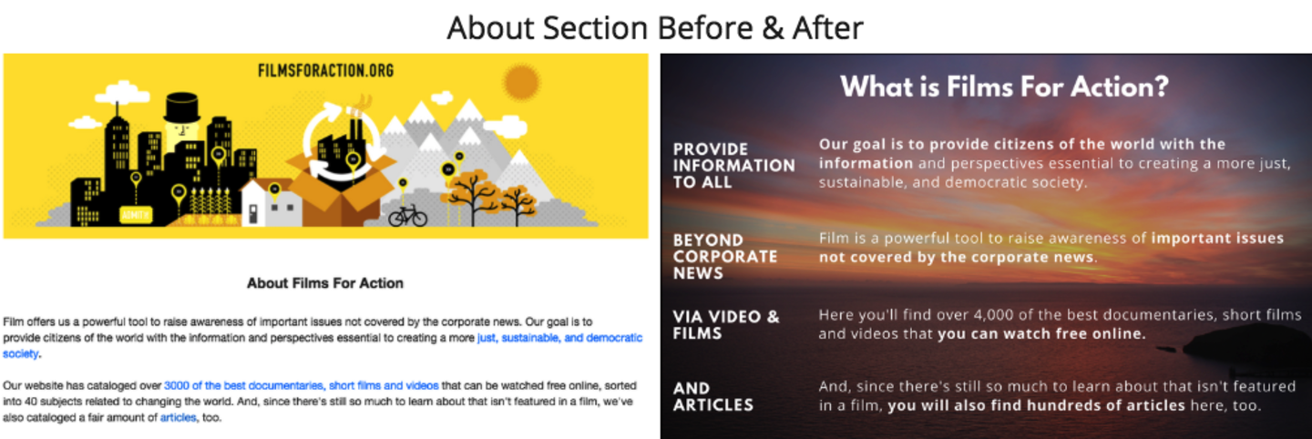
A before and after comparison of the about section. Bolder, bulleted subtitles allows for immediate understanding without having to read a paragraph. The background imagery is used as a tool to elicit a feeling.
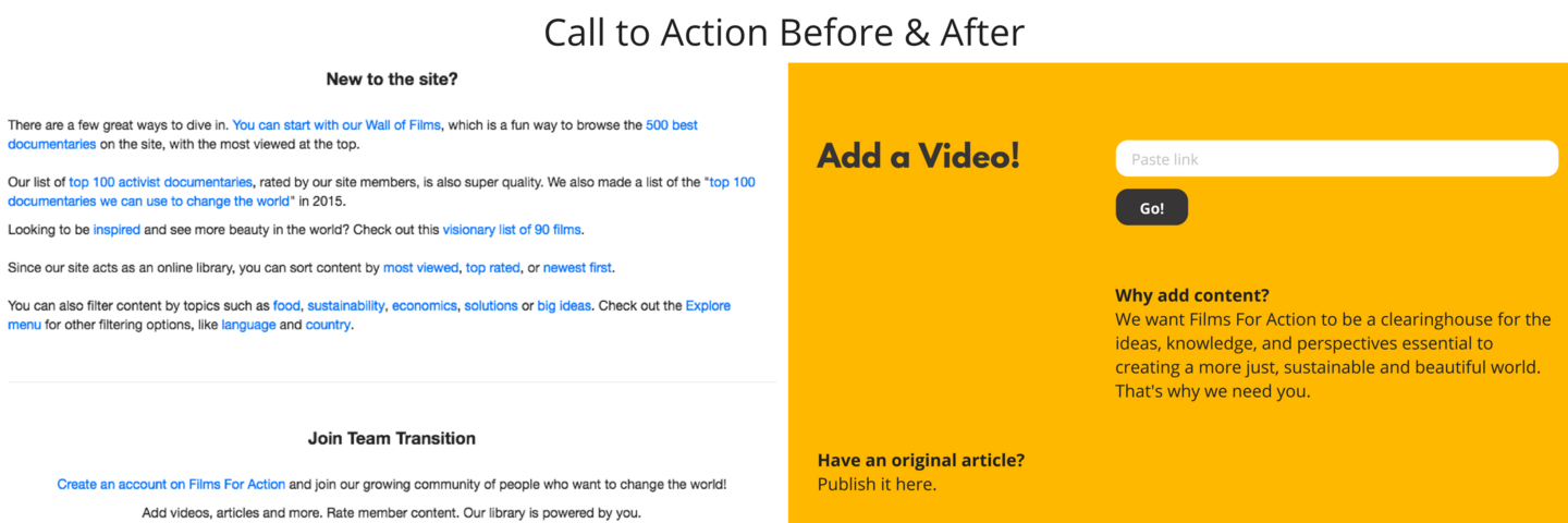
A before and after of the CTA (call to action) section. Every homepage visit has a supplementary goal, a call to action. I asked my client what the number one thing he would like to see his visitors do: "To upload content (video)". So we removed everything but that one action, making it clear what the viewer is expected to do next.

A before and after 'glance' at the homepage in its entirety -- this image is not meant to be read, but is more a way to show the transformation of the homepage, its user experience flow, and the use of aesthetics to break up sections allowing for better digestion of content by the user.

Role
It was my job to create a design mock-up and with input from the website owner and his web developer, we created an exciting new look and feel. See the About section for the design highlights.
Skills
- Brand Identity
- Graphic
- Web Design
Turnaround
Within 3 days
Cost
$1,200